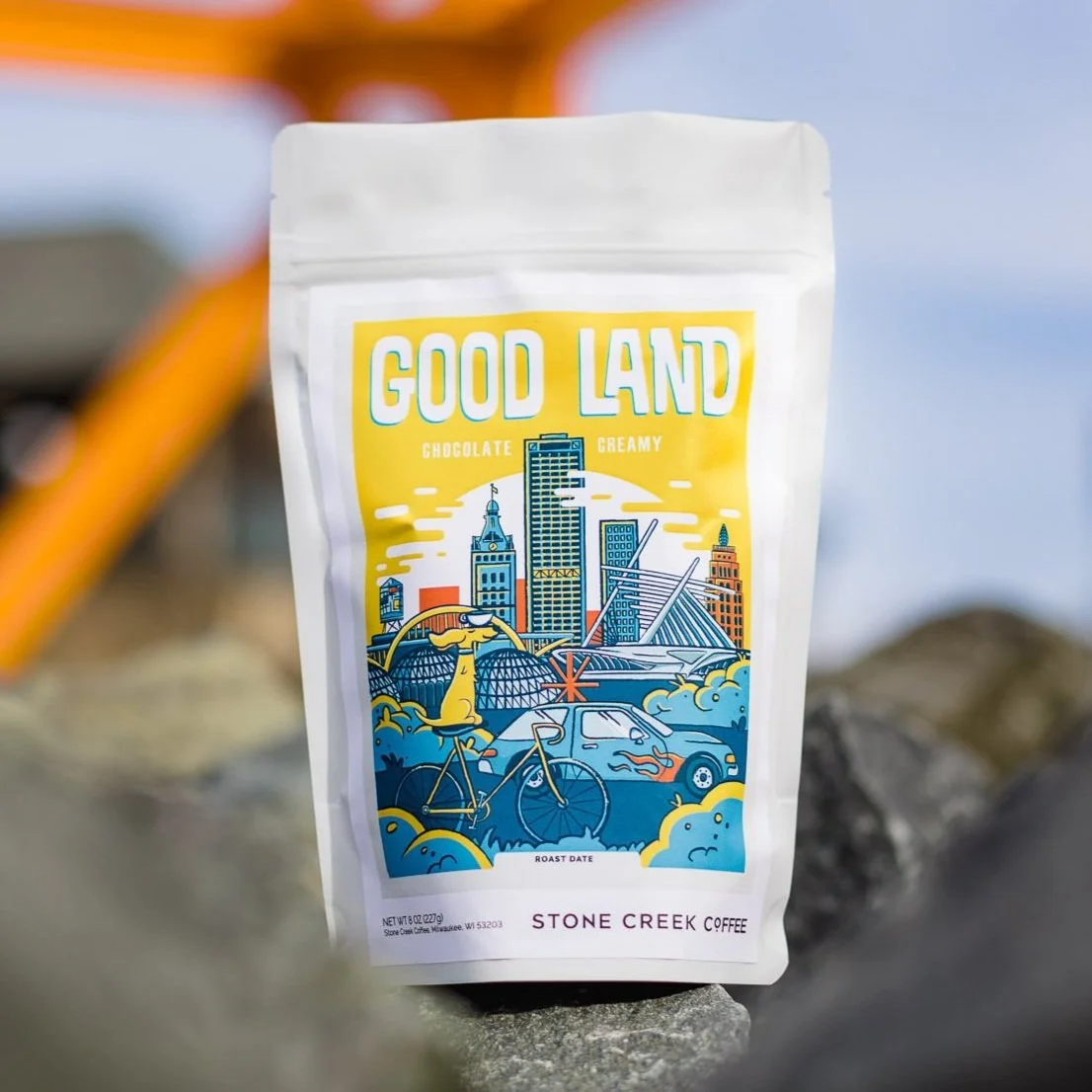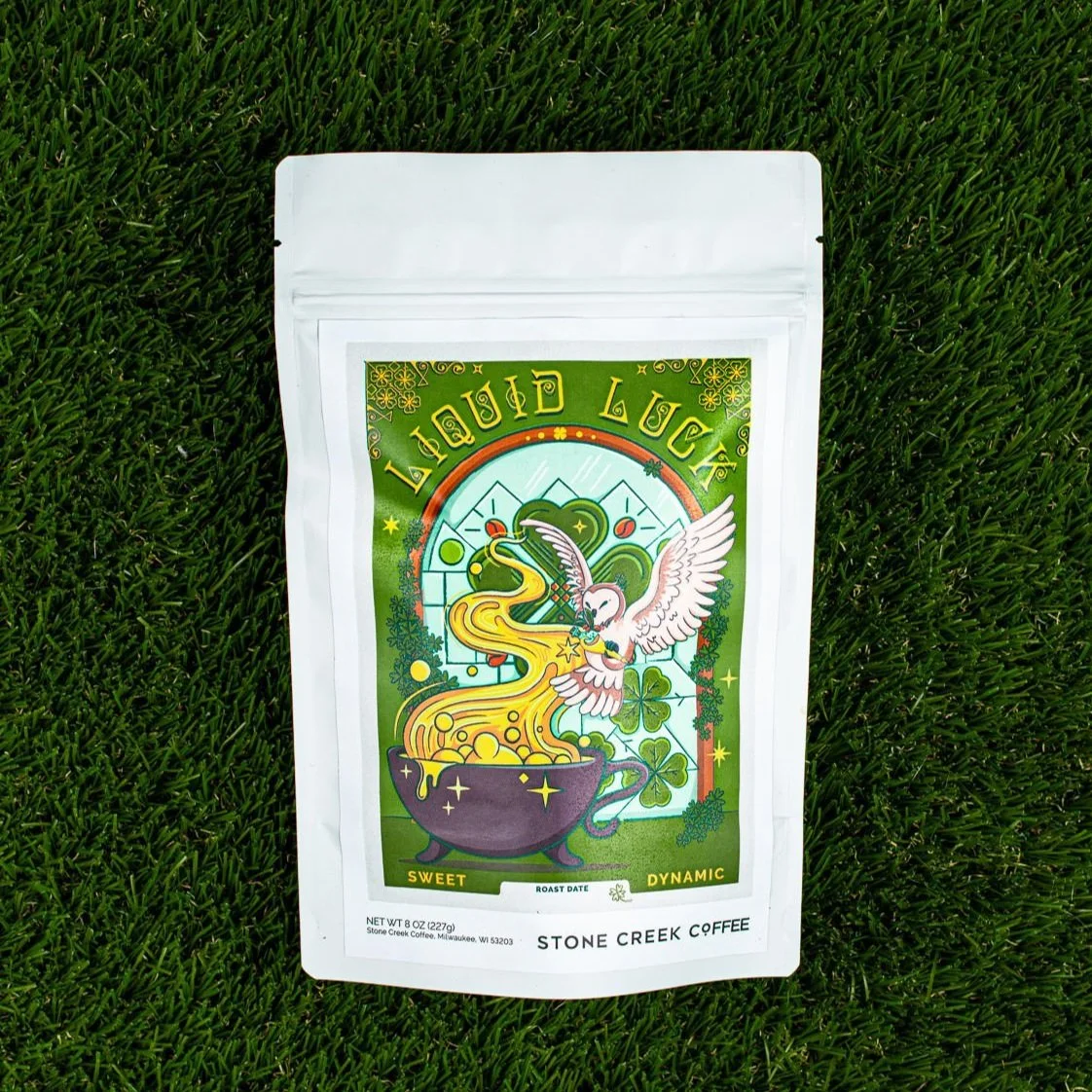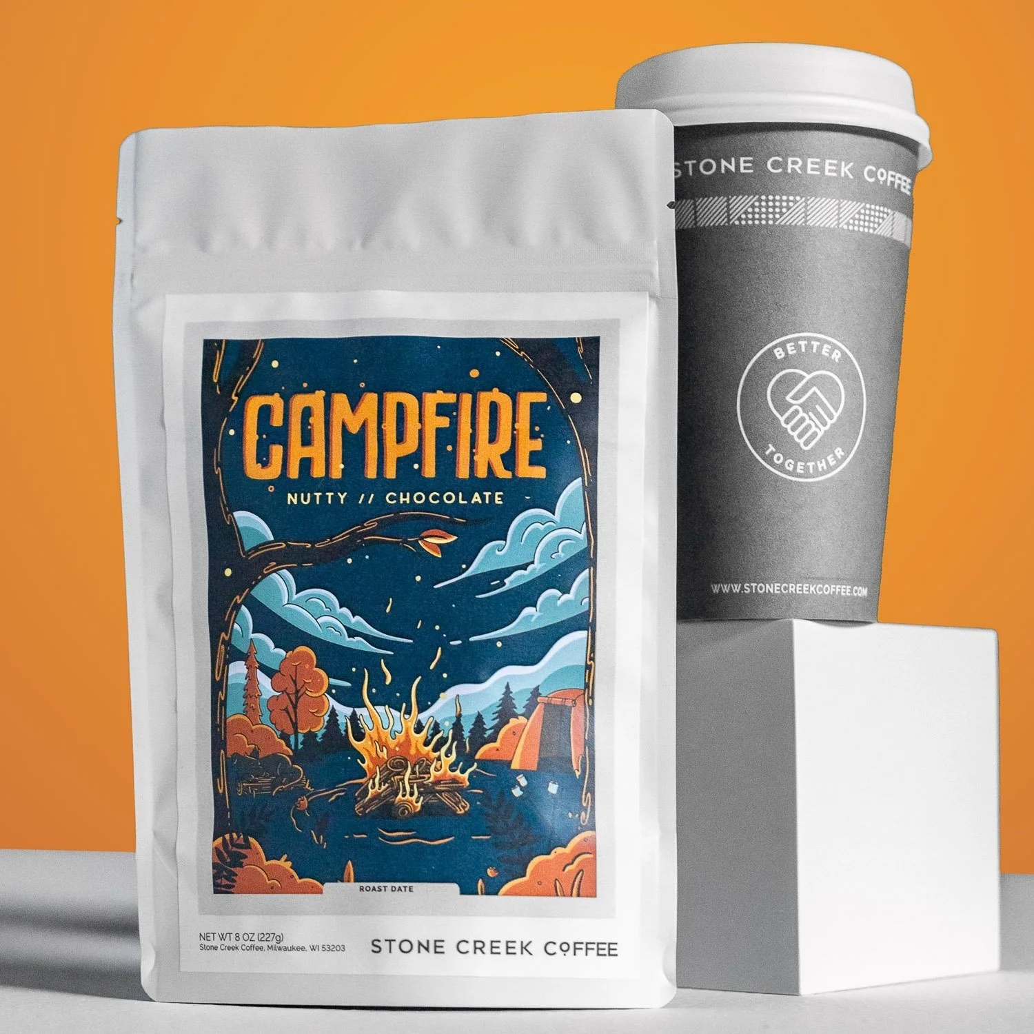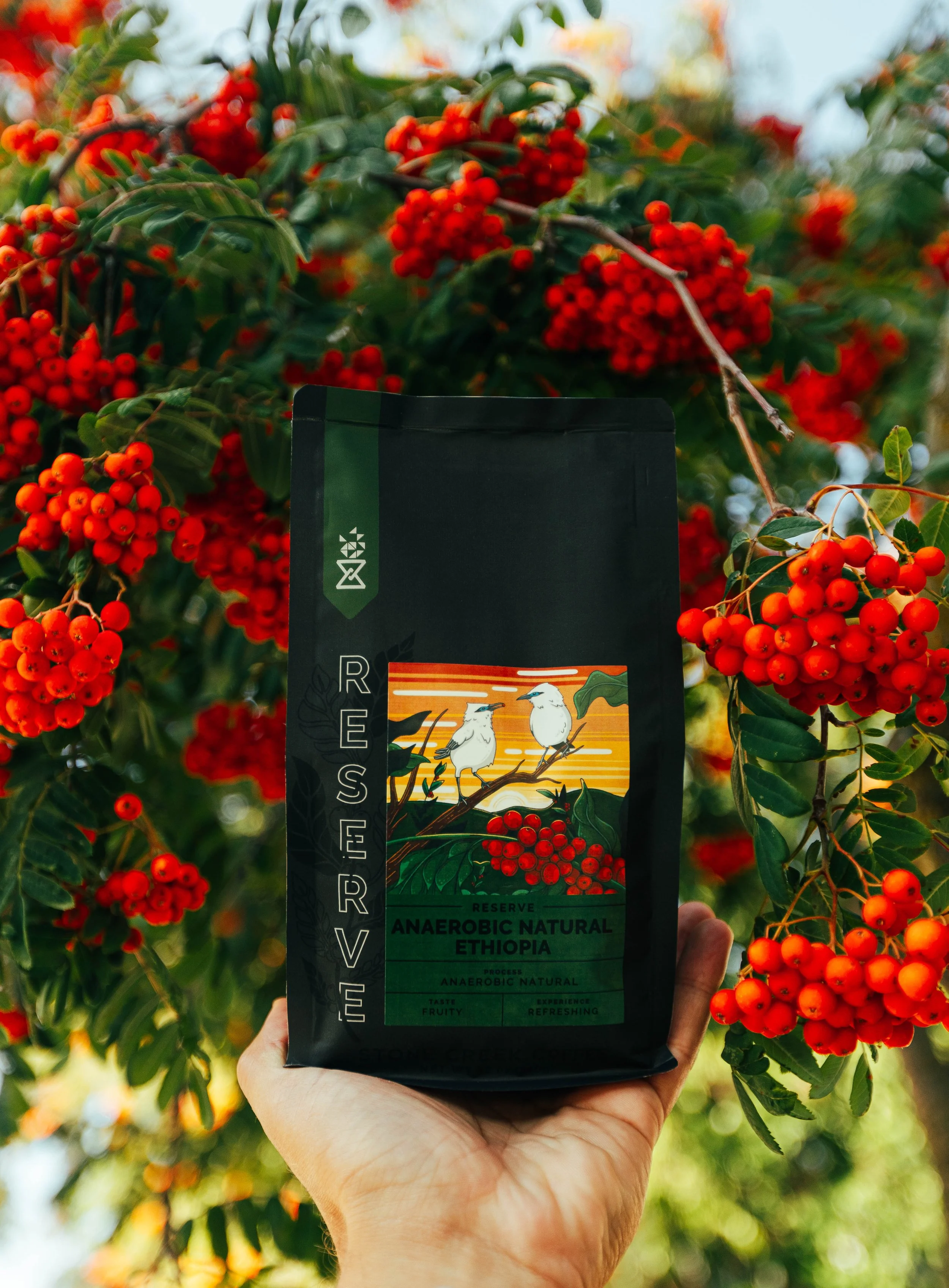
Illustrated coffee labels and seasonal packaging
One of the core values at Stone Creek is all about sharing the journey from farm to cup, and it starts with the packaging, your first glimpse into the coffee's origin story.
I've had the joy of bringing this journey to life through a collection of illustrated farm-to-cup stories that I designed. These illustrations were born out of the exciting rebranding efforts led by Kim Dunn and Kelsey Robinson back in 2021, with the creative guidance of Drew Pond and Eric Resch leading the way.
Since 2022, seasonal packaging designs followed the guidance of our 3 customer types while also celebrating the unique processing a specialty coffee went through.
Creative Direction: Drew Pond & Eric Resch
Design Direction & Illustration: Angeline Garvey
Product Photography: Jarvis Lawson
Holiday Coffee Collections
Holiday Inspired Coffee Illustrations
Candy Cane Lane | Short Run Coffee
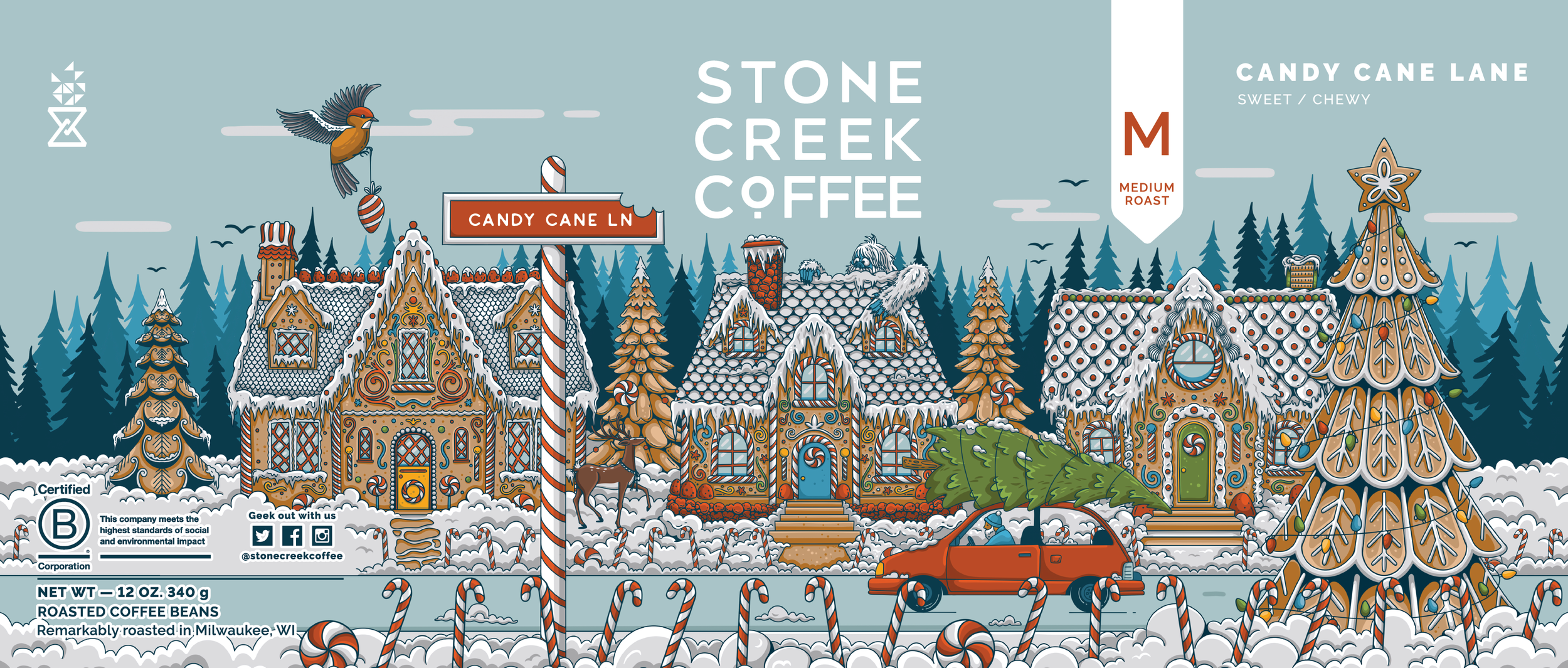

Candy Cane Lane | Short Run Coffee
reserve packaging and Labels
LIMITED PROCESSING METHODS
In 2023, I had the privilege of collaborating with Drew Pond to revamp the presentation of Stone Creek's limited reserve coffees. Our aim was to highlight the exceptional nature of this line. Stone Creek takes pride in selecting coffees with distinctive processing methods for their reserve collection, emphasizing the narrative behind each farm's processing experimentation.
To enhance the storytelling experience, I designed illustrations of coffee plants cascading inside the fold of the bag, creating an immersive journey through the farm's plants. This approach captures the essence of walking amidst the coffee plants themselves, inviting customers to connect with the origin of their brew further.


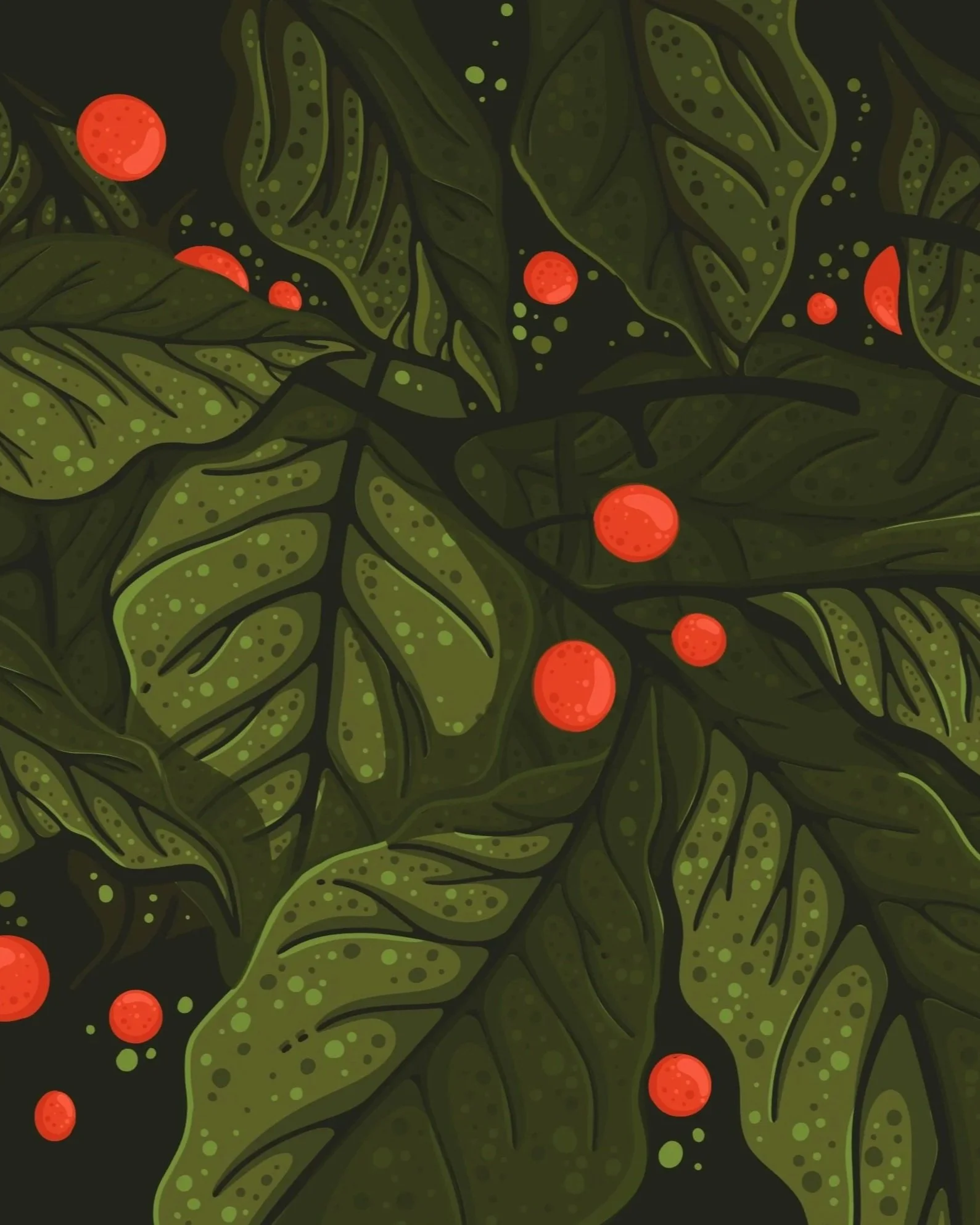
In December 2023, I had the incredible opportunity to journey to Guatemala as part of Stone Creek's employee trip to origin. It was an incredible experience witnessing the dedication behind harvesting coffee cherries at San Miguel Coffees. Feeling the leaves brush against my face and the joy of plucking ripe cherries on a volcano was a moment to never forget. Capturing that experience and translating it onto our packaging was thrilling to me in conveying the farm-to-cup narrative.
I had envisioned this illustration long before my trip, and experiencing it exactly as I imagined was immensely gratifying. This journey of picking coffee cherries has only scratched the surface of the farm to cup story but important to reflect upon in this reserve line before the cherry goes through its unique processing method.

The design direction for this bag demands a sense of sophistication and elegance, reflecting the premium nature of these coffees attributed to their unique processing methods. Maintaining a balance between luxury and functionality, I ensured that the typography seamlessly intertwines with the coffee plant motif, subtly complimenting the side panels of the bag.
I opted for a more subdued presence of the logo, recognizing that our coffee connoisseur customer values the narrative behind each cup above all else. These coffees embody the passion and curiosity shared by everyone at Stone Creek, serving as a gateway to deeper exploration and appreciation. The emphasis lies not solely on the brand, but rather on the enriching story and learning experience offered by each limited cup in this line.


SEASONAL COFFEE LABEL & BOX DESIGNS
This is a collection of seasonal labels, coffee tins and holiday boxes I have designed at Stone Creek Coffee.
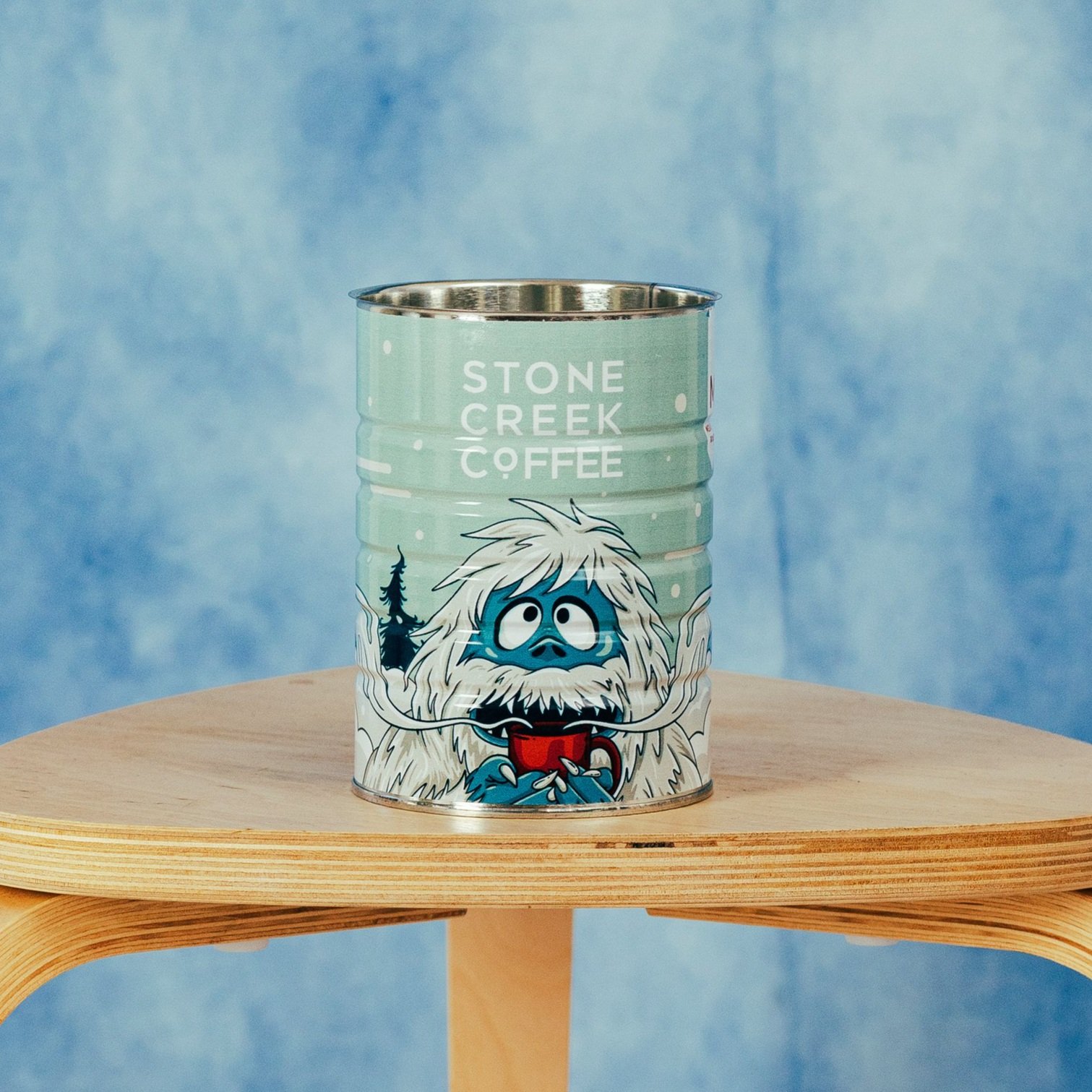


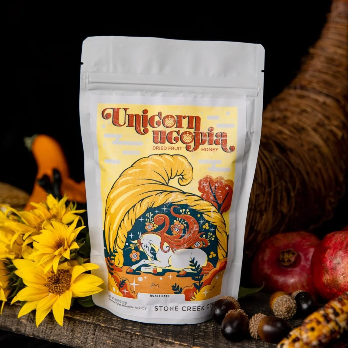
UNICORNUCOPIA 2022
UNICORNUCOPIA 2022

UNICORNUCOPIA 2022
UNICORNUCOPIA 2022
-
![]()
Oktoberfest 2021
-
![]()
Nightmare Before Coffee 2021
-
![]()
Unicornucopia 2021
-
![]()
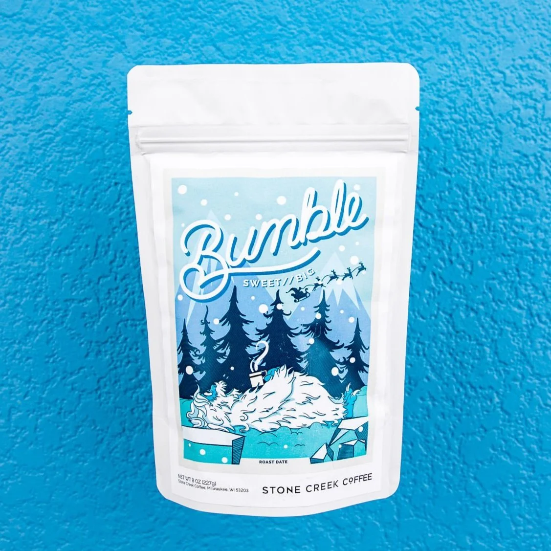
Bumble 2021
-
![]()
Lumos 2022
-
![]()
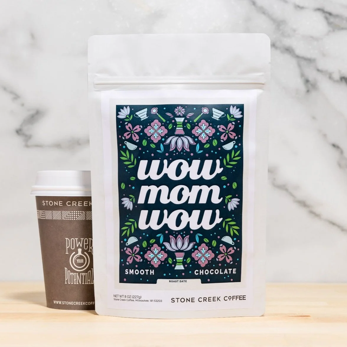
WOWMOMWOW 2022
-
![]()
Heart Beatz 2022
-
![]()
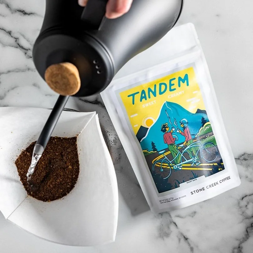
Tandem 2022
-
![]()
The Good Land 2022
-
![]()
Liquid Luck 2022
-
![]()
Rad Dad 2022
-
![]()
Campfire 2022