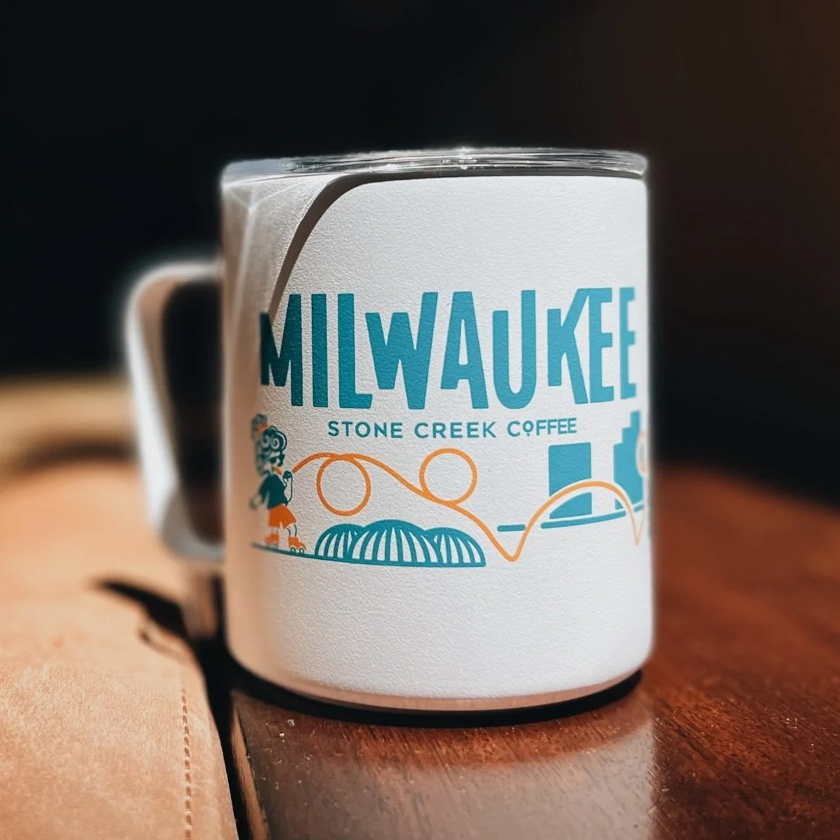
Milwaukee pattern collection
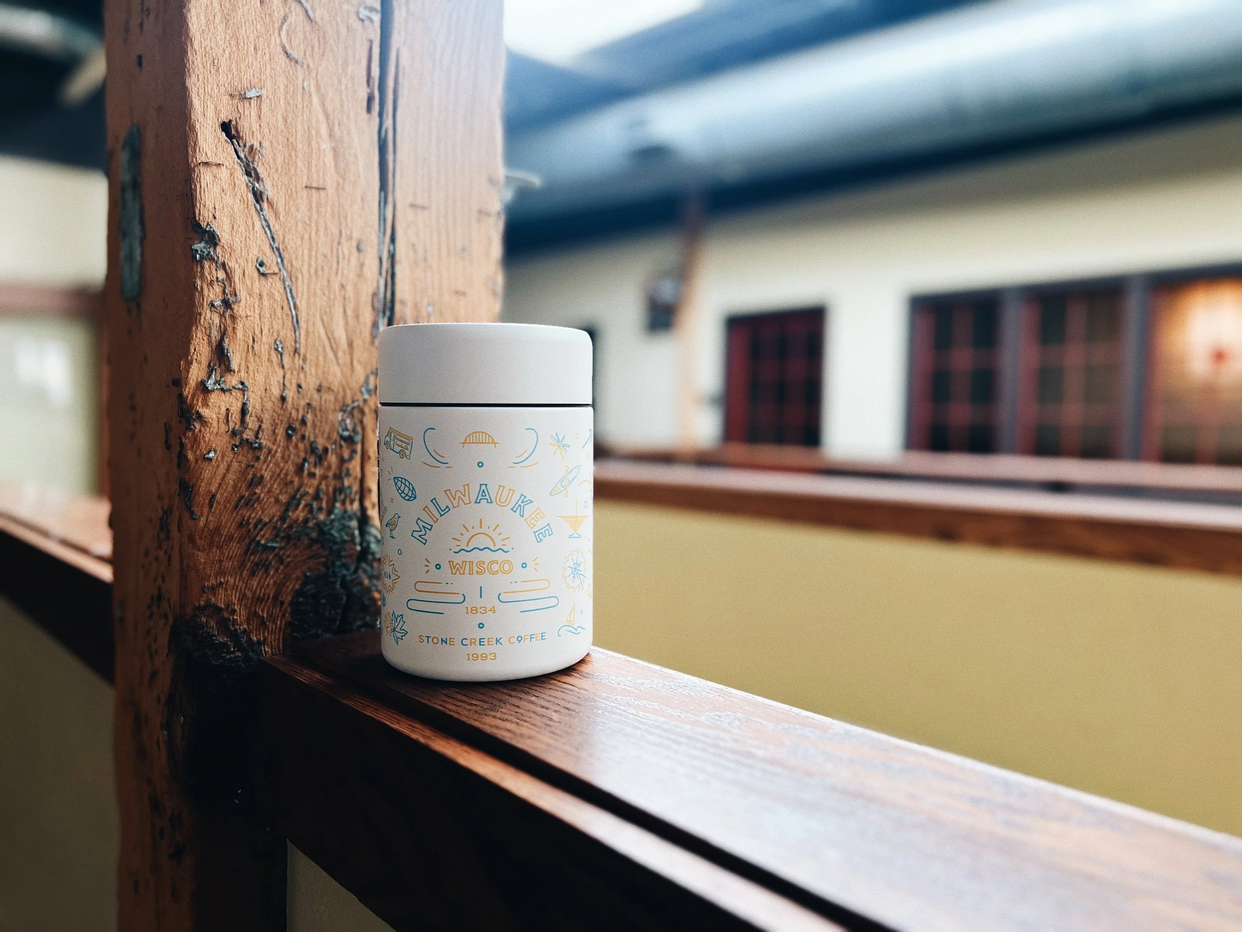
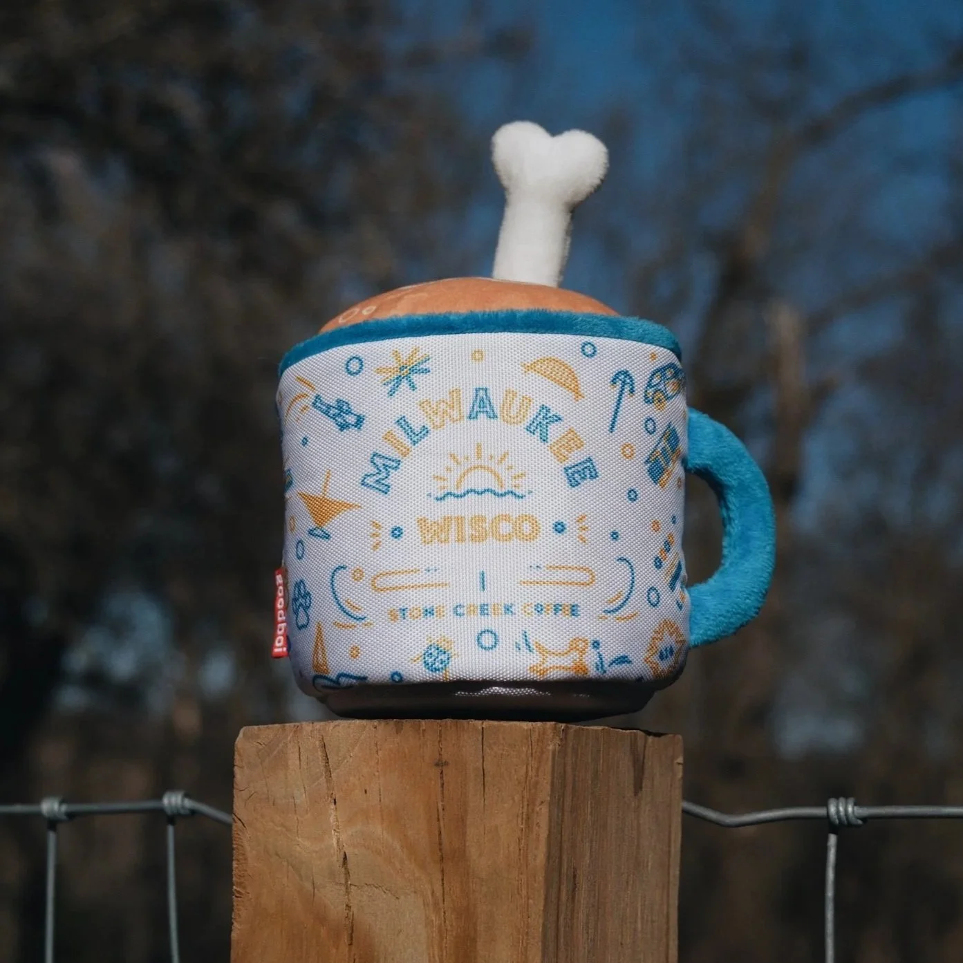
Stone Creek wanted to create a merchandise collection that celebrated its Milwaukee roots while feeling cohesive, collectible, and distinctly its own. I developed an illustrated pattern system built around recognizable Milwaukee architecture, local icons, and small easter eggs that reward a closer look.
To establish a strong visual identity across the collection, I anchored the palette in gold and blue as a nod to the Milwaukee People’s Flag, while using illustration to create a sense of place and personality. The system was designed to flex across a range of applications, from a ceramic mug and coffee canister to apparel, and a dog toy. The result is a collection that turns local pride into an engaging, giftable expression of the city and the people who call it home.
Creative Direction: Drew Pond & Eric Resch
Design Direction & Illustration: Angeline Garvey
Product Sourcing & Implementation: Harmony Krafttakacs
Product Photography: Jarvis Lawson




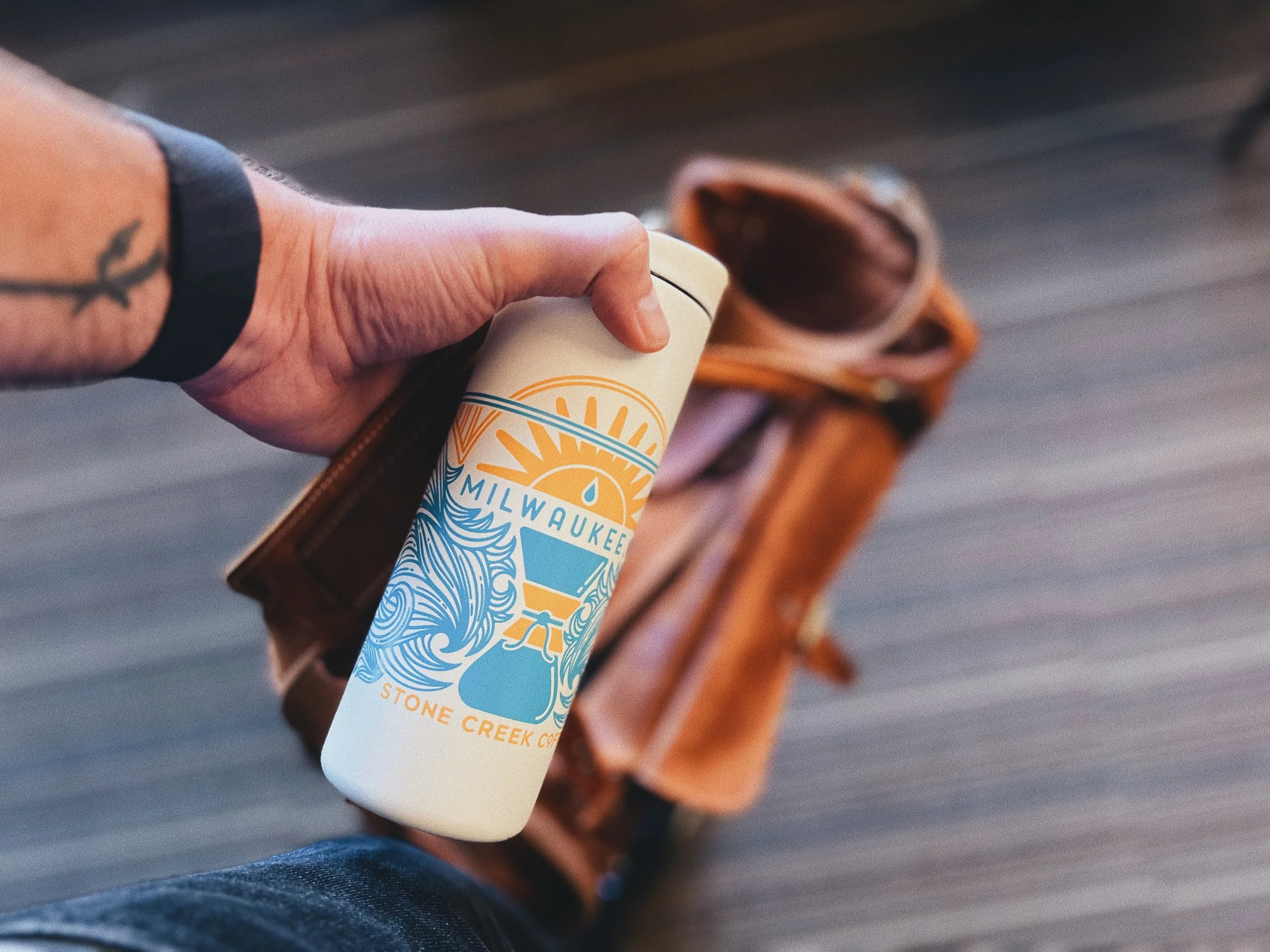
The collection expanded beyond the original pattern system to create a stronger visual bridge across Stone Creek’s Milwaukee-themed merchandise. I carried the same gold and blue palette onto elegant white MiiR travelers, featuring illustrations of the Hoan Bridge and Milwaukee’s lakefront cityscape. The compositions use the movement of the water and skyline to create visual energy while maintaining a clear connection to the broader collection.
These designs were not originally created as part of the pattern collection, but seeing the pieces together on the retail shelf revealed an opportunity to strengthen the collection as a cohesive visual system. I chose to carry the color and illustrative language across both groups, creating a more intentional relationship between individual products and a stronger overall presence at retail alongside a dedicated coffee label to the Good Land.